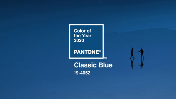
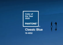
Each December, design enthusiasts, color experts, and style trend followers alike look forward to Pantone announcing the hue it has designated “the color of the year” for the next twelve months. For 2020, Pantone selected a truly timeless color, “Classic Blue.” Two decades ago, the iconic company selected another serene blue to usher in the new millennium, Cerulean Blue, causing surprise among some that it would select another medium blue shade exactly 20 years later.
There was a good reason for this year’s selection, as the color experts at Pantone looked to the current state of the world for inspiration. “We are living in a time that requires trust and faith,” explained Leatrice Eiseman, executive director of Pantone Color Institute. “It is this kind of constancy and confidence that is expressed by Pantone 19-4052 Classic Blue, a solid and dependable blue hue we can always rely on.”
Classic blue provides “a reassuring presence instilling calm, confidence and connection,” and the color blue is also associated with bringing clarity, focus, and introspection. “Classic Blue encourages us to look beyond the obvious to expand our thinking; challenging us to think more deeply, increase our perspective and open the flow of communication,” said Eiseman.
In recent years, the Pantone Color Institute has selected a peachy hue called “Living Coral;” “Greenery,” a bright lime green shade; a fuschia called “Radiant Orchid;” and an orange color named “Tangerine Tango.” “Mimosa” was 2009’s cheerful yellow pick, while 2002 saw a flaming red called “True Red” appearing everywhere.


Wondering how to incorporate this lush, yet calming, shade of blue into your home? You can start small if you prefer, or go big and bold if you’re more comfortable changing things up in dramatic ways.
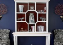
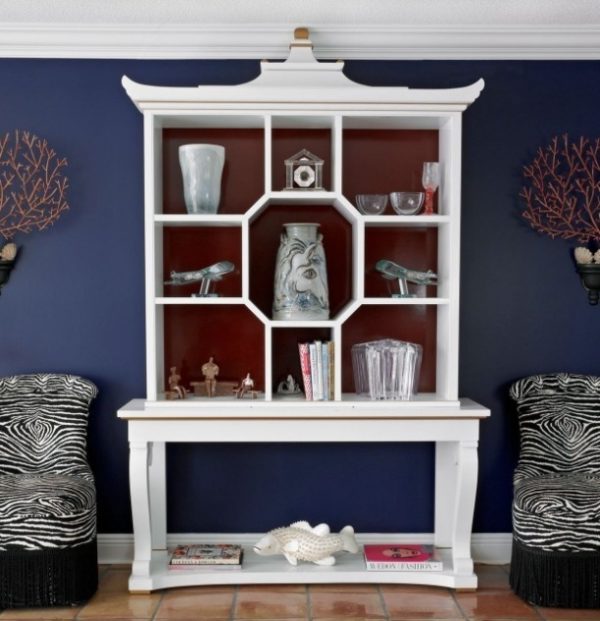
Selecting an accent wall or two in a space is an excellent way to get the stylish benefit of Classic Blue without making a huge commitment. As seen here, placing a white shelf in front of a deep blue wall is a clever way to maximize the color impact without painting the entire room.
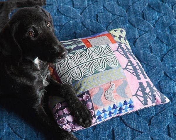
You can even select accent pieces or accessories in blue to get a feel for whether the shade will work for your room and your tastes. This blue blanket from Anthropologie is a good starting point. Just a hint of blue is enough to spruce up any space and bring your style into the new decade.
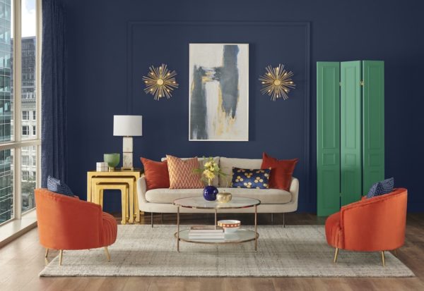
Don’t forget that it’s not necessary to use the exact shade that Pantone named for 2020. There are literally endless blue hues to select from. For example, Sherwin-Williams’ Naval Blue, seen here in the living room photo, is a close (but not identical) match. Sherwin-Williams has accented the deep blue wall color with a neutral, natural-fabric rug, bright orange chairs and cushions, and a jolt of cheery green in the form of a decorative screen in the corner. Metallic details in the furnishings and wall sconces add a sophisticated flair to the room.
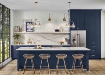
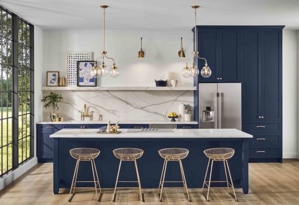
This kitchen also uses Sherwin-Williams’ Naval Blue as a bold cabinet color. The walls, floors, and counters are all neutral so eyes are naturally drawn to the deep blue of the custom cabinetry.
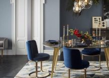
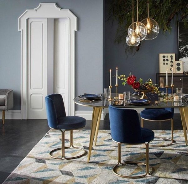
In this glamorous dining room, only the chairs and napkins are blue, but there’s enough of the color to convey its soothing, calming effects — wonderful for a quiet meal shared with loved ones.
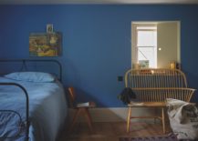
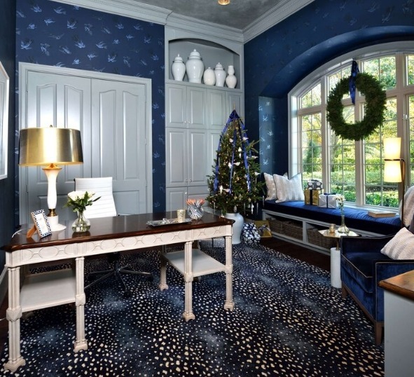
Classic Blue is the perfect shade for an office, study, or retreat. Here, it’s used liberally from floor to ceiling and even in the seasonal decorations. White, metallic, and natural wood elements keep it from being too dark or overbearing.
Pantone helpfully provides several coordinating color palettes with each of its annual selections. This year’s guide includes five different schemes that mesh seamlessly with Classic Blue: Ponder, Snorkel, Desert Twilight, Exotic Tastes, and Untraditional.
The colors in each palette work together to produce a different mood. For example, Desert Twilight is “suggestive of the early evening sky,” and provides “an elegant backdrop for a glittery grouping of sophisticated shades painted across the sky.” On the other hand, Pantone describes Ponder as a “thoughtful and meditative” scheme that “helps induce a gently calming effect and feelings of peaceful tranquility to the human spirit.”
Classic Blue offers something different for every taste, style, and space. Here’s to a new year and an exciting new color palette to explore and experiment with.
You're reading Meet Pantone’s Color Of The Year For 2020…, originally posted on Decoist. If you enjoyed this post, be sure to follow Decoist on Twitter, Facebook and Pinterest.
from Decoist https://ift.tt/2ukbmrp

0 comments: