The kitchen is the heart of the home, and it’s no secret that having the right tools can make all the difference when it comes to cooking. ...

Our Must-Have Kitchen Accessory: The Pot Filler

The kitchen is the heart of the home, and it’s no secret that having the right tools can make all the difference when it comes to cooking. One accessory that has become increasingly popular in modern kitchens is the pot filler. In this article, we will explore the history of the pot filler, its pros and cons, and whether it is really a necessary addition to your kitchen.

pot filler on brick backsplash with cream cupboards pot filler with marble white backsplash pot filler with grey marble backsplash pot filler with blue wavy marble backsplash Modern kitchen features gray glazed tiles with a brass swing arm pot filler over a black French stove accented with brass hardware. Kitchen features black cabinetry with black reeded trim and a polished brass swing arm pot filler on a marble slab backsplash. Transitional kitchen with mixed metals boasts a cooktop with a stainless steel vent hood and an antique brass pot filler on white subway tiles for a timeless appeal. A stainless steel range sits against ivory, orange, and black mosaic backsplash tiles fitted with an aged brass swing arm faucet mounted under a white hood. Kitchen features an arched cooking nook with glossy black grid tiles, a brass swing arm pot filler over a gold and black stove and white cabinet drawers with brass knobs and a marble countertop.

History

The pot filler, also known as the stove faucet or the pot filler faucet, is a long-standing fixture in many kitchens around the world. The invention of the pot filler dates back to the early 20th century, when the idea of running water in the home was still relatively new.

Transitional kitchen with mixed metals boasts a cooktop with a stainless steel vent hood and an antique brass pot filler on white subway tiles for a timeless appeal.
Photo Credit: Zoe Feldman Design

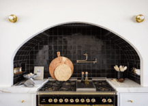
The first pot fillers were designed to be mounted above the stove, allowing cooks to easily fill pots with water for cooking without having to lug them across the kitchen. These early models were simple and functional, often made of brass or chrome, and featured a basic valve system that allowed for easy operation.

Kitchen features an arched cooking nook with glossy black grid tiles, a brass swing arm pot filler over a gold and black stove and white cabinet drawers with brass knobs and a marble countertop.
Photo Credit: The Lifestyled Co

Over time, the pot filler evolved to become a more stylish and versatile fixture in the kitchen. Manufacturers began to experiment with different materials and finishes, creating pot fillers that could match any kitchen decor. They also introduced a variety of new features, such as adjustable arms, swivel spouts, and even touchless operation.

A stainless steel range sits against ivory, orange, and black mosaic backsplash tiles fitted with an aged brass swing arm faucet mounted under a white hood.
Photo Credit: Jenkins Interiors

Despite these advances, the basic design of the pot filler has remained largely unchanged over the years. Today, the pot filler is a staple in any modern kitchen, providing a convenient and efficient way to fill pots and pans with water for cooking.

Advantages of a Pot Filler

One of the main advantages of a pot filler is that it saves time and effort. Rather than having to lug heavy pots filled with water from the sink to the stove, you can fill them up directly from the pot filler. This is especially useful if you frequently cook pasta, soup, or other dishes that require a large amount of water.

pot filler on brick backsplash with cream cupboards
Photo Credit: Holly Grace

Another benefit of the pot filler is that it can help prevent spills and splatters. When you fill a large pot with water at the sink, there is a risk of water splashing onto the floor or countertop. With a pot filler, the water flows directly into the pot, eliminating this risk. This can be particularly useful in a busy kitchen, where spills can lead to slips and falls.

Kitchen features black cabinetry with black reeded trim and a polished brass swing arm pot filler on a marble slab backsplash.
Photo Credit: The Lifestyled Co

The Disadvantages of a Pot Filler

However, there are also some potential drawbacks to consider before installing a pot filler. One of the main concerns is the cost. Pot fillers can be quite expensive, especially if you opt for a high-end model. In addition to the cost of the fixture itself, you may need to hire a plumber to install it, which can add to the overall expense.

pot filler with marble white backsplash
Photo Credit: PC Photography from Getty Images via Canva

Another potential issue with pot fillers is that they can take up valuable space in your kitchen. Depending on the layout of your kitchen, installing a pot filler may mean sacrificing counter space or cabinet storage. It’s important to carefully consider the placement of the pot filler to ensure that it doesn’t interfere with your existing kitchen design.

So, is a pot filler really a necessary addition to your kitchen? The answer to this question will depend on your personal preferences and cooking habits. If you frequently cook large meals or entertain guests, a pot filler may be a worthwhile investment. On the other hand, if you primarily cook for yourself or a small family, you may find that a pot filler is not necessary.

pot filler with grey marble backsplash
Photo Credit: Avi Loren Fox from Getty Images via Canva

Ultimately, the decision to install a pot filler in your kitchen should be based on your individual needs and preferences. If you do decide to go ahead with the installation, be sure to choose a reputable brand and hire a qualified plumber to ensure that the job is done correctly. With the right pot filler, you can enjoy a more efficient and enjoyable cooking experience in your home kitchen.

Styles

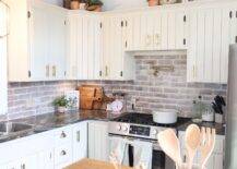
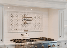
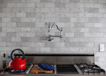
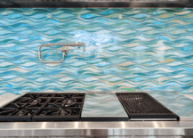
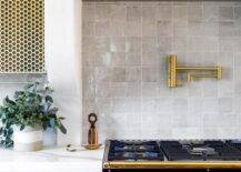
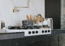
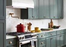
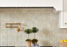
When it comes to pot fillers, there are several different styles to consider. One of the most popular styles of pot filler is the wall-mounted option. This style is mounted to the wall above the stove and typically has a long, adjustable arm that swings out to fill pots and pans. Wall-mounted pot fillers are great for those who want to save counter space and keep their stovetop clutter-free. They are also easy to install and can be a great addition to any kitchen.

pot filler with blue wavy marble backsplash
Photo Credit: JodiJacobson from Getty Images Signature via Canva

Another style of pot filler is the deck-mounted option. This style is installed directly onto the countertop and typically has a shorter arm than the wall-mounted option. Deck-mounted pot fillers are great for those who don’t have enough space on their walls to install a wall-mounted option. They are also great for those who want to add a unique touch to their kitchen design.

Modern kitchen features gray glazed tiles with a brass swing arm pot filler over a black French stove accented with brass hardware.
Photo Credit: Lindye Galloway

For those who want a pot filler that can easily be tucked away when not in use, the retractable option is a great choice. This style is installed directly onto the countertop and has a retractable arm that can be pulled out when needed and pushed back in when not in use. Retractable pot fillers are great for those who want to keep their kitchen looking sleek and modern.

Finally, there is the commercial-style pot filler. This style is typically found in professional kitchens and has a heavy-duty design that can withstand frequent use. Commercial-style pot fillers are great for those who do a lot of cooking and need a durable option that can keep up with their demands.

You're reading Our Must-Have Kitchen Accessory: The Pot Filler, originally posted on Decoist. If you enjoyed this post, be sure to follow Decoist on Twitter, Facebook and Pinterest.


from decoist https://ift.tt/7pXk1t4

0 comments:

The dining room is an important space dedicated to home entertainment and enjoying homemade meals with family and friends. The lighting in t...

How to Choose Dining Room Light Fixtures

The dining room is an important space dedicated to home entertainment and enjoying homemade meals with family and friends. The lighting in this room helps set an inviting ambiance and also impacts the overall design. 

A stylish fixture that matches the interior style will anchor the dining table, fostering a pleasant environment for entertaining. This post highlights some expert insights and practical tips to help you choose the perfect dining room lighting.

dining room light fixture dining room light fixture dining room light fixture dining room light fixture dining room light fixture dining room light fixture dining room light fixture dining room light fixture dining room light fixture dining room light fixture dining room light fixture

Pick the right size

Style isn’t the only consideration when choosing your lighting. The size determines whether the fixture will fit perfectly or stand out oddly. According to a general rule of thumb, the lighting fixture should be one-third of the table’s width to look proportional.

5829a48368b64600x-94160
Photo Credits: Style Me Pretty

Placement

Should the lighting fixture take a central position in a room? The placement depends on the dining table’s location. 

A statement light fixture should be centered above the table, no matter where it is located in the room. This emphasizes the dining area and creates an intentional setting, and also helps divide an open-space area into zones. 

Place low-hanging fixtures at least 36 inches above the table to avoid contact with the centerpiece. This is a comfortable height that allows everyone seated at the table to see each other and interact. However, this depends on your space, so double-check before the installation.

Emily-Henderson_House-Tours_Francois-et-Moi_7-79089-scaled
Photo Credits: Emily Henderson

Design

The lighting fixture does much more than flood the space with light, it also complements the room’s style and sets the tone. Whether it is an elegant chandelier that brings drama or a sleek pendant that matches a minimalist vibe, the lighting fixture becomes the ultimate focal point in the space.

Low-hanging fixtures emphasize the dining table and create a pleasant conversational area. A chandelier is an eye-catching piece that is available in many different styles.

fullsizeoutput_2069-768x1024-1-53023
Photo Credits: Oh, How Charming

Pendants are ideal for modern and minimalist dining rooms. Go with one large pendant or experiment with three smaller ones to make a bold statement. 

Don’t forget that a single lighting fixture might not be enough to brighten the whole dining room. Go for complementary lighting options that illuminate dark corners and create a bright and airy space. Recessed lighting and wall sconces bring additional light into the room. 

Line-Borella-Hometour-15-933x1400-1-37499
Photo Credits: Our Food Stories
Christmas-holiday-dining-room-boho-chic-basket-pendant-white-tulip-table-round-jute-rug-how-to-style-modern-boho-chic-dining-space-1-56310
Photo credits: Z Design
AF1F6277-C62C-4454-94BD-8D8995D00A6E-35371
Photo Credits: Little Reesor House
xl-1-40413
Photo Credits: Studio McGee
Melanie_Burstin_Dining_Room_1-1559x2048-1-45326
Photo Credits: Style By Emily Henderson
IMG_5986-1583x2048-1-37217
Photo Credits: Bless This Nest
dining room light fixture
Photo Credits: Gummergal
modern-farmhouse-diining-nook-21-31504-scaled
Photo Credits: Designing Vibes
DSC_2857-Edit-Edit-28804
Photo Credits: Monika Hibbs

You're reading How to Choose Dining Room Light Fixtures, originally posted on Decoist. If you enjoyed this post, be sure to follow Decoist on Twitter, Facebook and Pinterest.


from decoist https://ift.tt/hGTaLyq

0 comments:

Many studies over the decades have shown that colors can influence our mood. Strategic use of color has the potential to boost your motivati...

5 Paint Colors for Your Home Office to Help Boost Your Productivity

Many studies over the decades have shown that colors can influence our mood. Strategic use of color has the potential to boost your motivation, elevate energy levels, and increase overall productivity. So how can you use color to set a mood that fits your job? Here, we share the top five colors for a home office – plus some you’ll want to avoid.

home office home office home office home office green home office green home office red home office red home office brown home office

1. Blue for overall productivity 

Blue is an all-time favorite for office settings, and it’s easy to see why. The color is often used in the advertising industry to project security and trustworthiness.

Blue sets a soothing and calm atmosphere, which is perfect for fast-paced jobs. Also, it is known as a color that promotes creativity. 

Blue positively affects the body, reducing blood pressure and slowing the heart rate. This results in stress relief, promoting body and mind relaxation. Therefore, you can focus on completing their work tasks.

334485139_1159404268073221_5822916660886139885_n-89272
Photo Credits: Jacquelyn Clark
light-blue-home-office-8-55315
Photo Credits: Kate Knowles Home

2. Yellow for jobs that involve creativity

Yellow is associated with originality, happiness, and creativity. Whether you’re a writer or designer, a yellow home office sets a tranquil working environment that gets your creative juices flowing.

The sunny color is also known to promote collaboration. Therefore, a yellow accent wall is an ideal backdrop for your online meetings. 

However, it is essential to note that the overuse of yellow can induce eye fatigue. Pale tones are a great choice since they aren’t too harsh on the eyes.

ispydiy_paintedwall8-46602
Photo Credits: I Spy DIY
IMG_1764-min
Photo Credits: Dove Cottage

3. Green for improved decision-making

Green is a color associated with nature, reminiscent of lush foliage. It is located in the middle of the spectrum, making it easier for our eyes to process. Therefore, it relieves eye strain and increases focus during long hours of working. 

Green is known for improving problem-solving and memory while promoting positive thinking. It is an ideal color choice for jobs that involve decision-making and it’s also good for individuals who suffer from screen-induced eye strain.

green home office
Photo Credits: Jessica Brigham
Home-Office-Renovation-16-685x1024-1-75440
Photo Credits: Signed, Samantha

4. Red for boosting energy

Red is a fiery color that injects energy into the room. It’s ideal for active workspaces. 

However, this is a very stimulating color and should be used cautiously. Red increases blood flow and heart rate, which can negatively impact your productivity. Going overboard with this bold color can overwhelm the mind and provoke anxiety, so using it as an accent is better. 

artful-living-jessica-jubelirer-design-img9031190202a606ad_14-6491-1-f829775-85081
Photo Credits: Houzz
pratt-and-lambert-stephen-pappas-interiors-imge871f1f50966b20b_16-2977-1-0ff740e-85969
Photo Credits: Houzz

5. Brown for improved focus

Brown is a grounded color that promotes stability. Warm browns help set a cozy environment where your body can relax and focus on the work tasks.

This calming color that brings nature inside is perfect for jobs that involve focus and concentration. A rich chocolate brown tone with neutrals is a soothing color scheme for a workspace.

brown home office
Photo Credits: Studio McGee

Colors to avoid in a home office

  • White is a boring color that doesn’t create energy flow. Its only benefit is promoting a sense of cleanliness, but we can leave that for a clinical environment. You can still use white as a base, but layer other accent colors to set your desired mood.
  • Gray is a versatile and elegant color, but it can make a home office feel depressing. Light gray is reminiscent of a cloudy and rainy day and won’t do much to improve productivity.
  • Black is too dark to be used in a home office. Like gray, it can create a melancholy atmosphere.

You're reading 5 Paint Colors for Your Home Office to Help Boost Your Productivity, originally posted on Decoist. If you enjoyed this post, be sure to follow Decoist on Twitter, Facebook and Pinterest.


from decoist https://ift.tt/kgyrANL

0 comments:

Fall is the time of the year when we want to dress our homes in warm neutrals and add autumn accents. In 2023, we’ll see lots of earthy neut...

Fall 2023 Home Decor Trends To Watch For This Year

Fall is the time of the year when we want to dress our homes in warm neutrals and add autumn accents. In 2023, we’ll see lots of earthy neutral schemes, natural textures, and organic shapes.

Are you ready to explore some fresh updates for the new season? Here, we share the top fall 2023 home decor trends that will help you set an inviting and cozy atmosphere in your home! 

Earthy hues

Dressing your home in earthy hues infuses the indoors with the natural landscape outdoors. Warmer tones convey the fall color spectrum, where the beauty of the fall foliage dominates. 

Last year, grays and bold tones dominated the design world. This year the trends turn to a softer and warmer color palette. The top color schemes are revamped with nature-inspired tones, from sand and oatmeal as neutrals to apricot and copper as warm accents. 

Bright accents are swapped out for muted and softer versions. Shades like paprika and terracotta will be an ideal choice for accents.

Cozy-Fall-Living-Room-Organic-Modern-Design-0777-70561
Photo Credits: Caitlin Marie
Simple-and-Cozy-Fall-Tablescape-9292-47806
Photo Credits: Caitlin Marie

Gallery wall

A gallery wall is a versatile feature that flatters any space and style. This year’s fall trends feature a strong tendency for gallery walls, focusing on mixing and matching different styles of frames. Why not enhance your collection with ornate vintage frames and curate an Instagram-worthy gallery wall?

IMG_7738-64246
Photo Credits: Gathered Living

Wood 

Woodgrain texture is a grounding element in rich and cozy interiors that can be implemented in small furniture and decor. A wooden picture frame or large bowl on a side table adds a touch of coziness to the space and easily blends in with your year-round decor.

fall-decor-tips-2-86050
Photo credits: Create Enjoy

Velvet

As the weather gets colder, the embrace of plush fabrics warms our hearts. The luxurious feel of velvet sets the perfect fall ambiance and creates a cozy sanctuary where you’ll want to seek refuge from the chilly weather. Elegant velvet throw pillows in terracotta and deep green are perfect for making your home fall-ready.

IMG_4941-99394
Photo Credits: Unique Tailor Made

Stone

As natural materials make their way onto fall-inspired mood boards, stone is an ideal option for contrasting the warmth of wood. Its natural grain or veining adds a unique visual touch to the space. Marble and granite bring understated elegance to this room, in the form of decorative bowls and trays.

tray-16691
Photo Credits: Meghan Basigner

Trending paint colors for fall 2023

The 2023 fall color palettes are heavily inspired by nature. Deep green, terracotta, tan, and greige are the ultimate choices for curating a fall-ready interior. Aubergine and dark blue are daring choices for those who aren’t afraid to make a bold statement. 

Here are the trending paint colors for the 2023 fall season. Also, we share the exact paint brands that offer them. 

Deep green

As earthy tones conquer the design scene in fall, it’s time to embrace nature at its best. Muted green sets a calm mood while adding a touch of elegance. 

Benjamin Moore Boreal Forest is a gorgeous deep green that flatters both rustic and elegant styles. It is the ideal color for painting kitchen cabinets or creating a focal wall. 

Sherwin Williams Forestwood is another muted green to consider for your next painting project. It is a deep green that brings sophistication to a space. Sherwin Williams Rock Bottom is a mossy green-gray color, perfect for making a bold statement.

MG_2388-76291
Photo Credits: Jenna Sue Design

Greige

Greige is a gorgeous neutral that creates a subtle base for layering with other colors. This tone perfectly balances gray and beige, remaining relatively neutral. It is often used as an alternative to crisp white walls to achieve subtle depth and introduce coziness. 

Greige is a versatile paint choice for any room. Its soft touch adds depth to a space, whether it is the living room walls, kitchen cabinets, or bathroom walls. 

There are so many greige paint choices on the market that differ in depth and undertones. Sherwin Williams Perfect Greige is a gorgeous gray with warm undertones. Accessible Beige is another versatile neutral that still has a touch of warmth. Agreeable Gray is a top seller being a light gray with a warm touch. 

The Benjamin Moore collection has a wide range of greige tones. Revere Pewter, Edgecomb Gray, Classic Gray, Natural Cream, Balboa Mist, and Pashima are their top sellers in the greige category.

agreeable-gray-9
Photo Credits: Stefana Silber
agreeable-gray-sherwin-williams-piperpstromatt-68713
Photo Credits: Jenna Kate

Terracotta

Terracotta conveys clay’s natural beauty, falling between brown and red-orange. It is the perfect color to introduce warmth to a space and prepare it for those rainy fall days when you want to stay home and cozy up with a blanket.

Benjamin Moore Cinnamon is a rich brown with a prominent orange undertone. Sherwin Williams Peppery is a comforting and inviting orange.

red-paint-018-cinnamon-2174-20-rgb-52465
Photo Credits: Benjamin Moore
SW6615-peppery-lg-74356
Photo Credits: Sherwin Williams

Dark Blue

When speaking of versatility and drama, dark blue has it all. It is a bold color that stands out but is easy to tone down with neutrals. 

Mixing it with cool grays creates a modern and refined color scheme. On the other hand, pairing with warm accents such as wood and polished brass strikes a harmonious balance between rustic charm and chic elegance.

Benjamin Moore Hale Navy is an exquisite deep color that acts like a neutral. We can envision dark blue cabinets paired with brass hardware for a modern rustic vibe.

blue-paint-130-hale-navy-HC-154-rgb-92779
Photo Credits: Benjamin Moore

Sherwin Williams Naval is a gorgeous deep blue with a cool undertone. It is a bold color that makes a statement but perfectly complements neutral color schemes.

SW6244-naval-lg-54393
Photo Credits: Sherwin Williams

Tan

Neutrals have always been around, but now their presence is more prominent. Tan is one of the most popular choices, making its way into fall color palettes thanks to its versatility.

Sherwin Williams Natural Tan is a sophisticated neutral that induces serenity in a space. Thanks to its moderate warmth, it pairs perfectly with woodgrain and warm accents.

SW7567-natural-tan-lg-59849
Photo Credits: Sherwin Williams

Benjamin Moore Manchester Tan is a gorgeous beige tone with prominent warm undertones. This neutral color is the perfect base for layering your fall palette. 

DBD2BC_3e980fd1-591d-494f-83a8-04cbd156f5f5_1024x-59919
Photo Credits: Benjamin Moore

Aubergine

The rich aubergine color is prominent on the design scene, perfect for those who want to make a daring statement. The rich purple that carries the color of eggplant is ideal for accent walls, powder rooms, or furniture. Benjamin Moore’s Eggplant is a perfect depiction of the natural color, a sophisticated purple with a hint of red.

purple-paint-175-eggplant-1379-rgb-69771
Photo Credits: Benjamin Moore

You're reading Fall 2023 Home Decor Trends To Watch For This Year, originally posted on Decoist. If you enjoyed this post, be sure to follow Decoist on Twitter, Facebook and Pinterest.


from decoist https://ift.tt/vfOT9DW

0 comments: