Color blocking is a popular trend in interior home design that involves using bold and contrasting colors to create a visually striking space. This technique can be applied to walls, furniture, and decor, adding a vibrant and energetic feel to any room.
From minimalist to maximalist styles, color blocking can be personalized to fit any design aesthetic. In this article, we will explore the history of color blocking, its benefits, and provide tips on how to incorporate it into your own home design.
What is Color Blocking?
Color blocking is a popular interior design technique that involves using contrasting colors in a space to create a bold and visually striking effect. This technique entails grouping together different colors in a way that creates a strong visual impact rather than blending them together. To achieve this effect, designers often use bright, bold colors that stand out from each other, such as red and blue or yellow and green.
When it comes to home interior design, color blocking can be used in a variety of ways. One popular approach is to use color blocking on walls or furnishings, such as painting one wall in a bright, contrasting color or using bold, colorful pillows on a neutral-colored sofa. Another approach is to use color blocking in smaller details, such as through the use of decor items like vases, artwork, or rugs.
Here are five ways to use color blocking in your home decor:
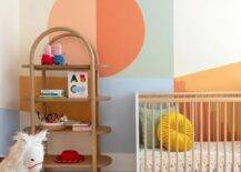
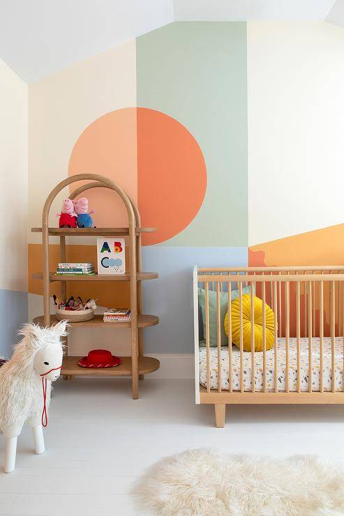
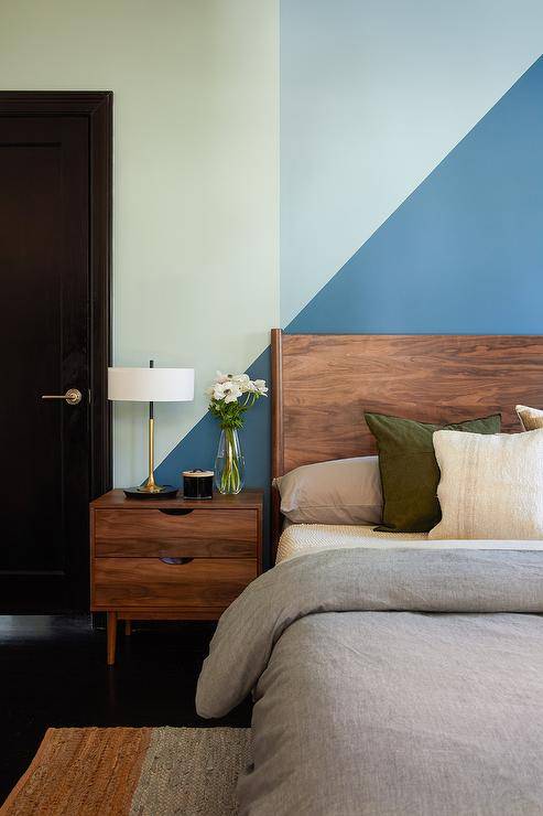
Accent Walls
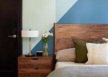
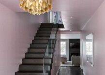
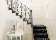
One of the easiest ways to incorporate color blocking in your decor is by using it on an accent wall. Choose a wall in a room that you want to draw attention to and paint it a bright and contrasting color. This will add depth and interest to the room.
Furniture
Another way to incorporate color blocking is by using it on your furniture. For example, you could choose a sofa with contrasting cushions or a coffee table with a brightly colored base and a contrasting top. This will add a pop of color to your room without overwhelming it.
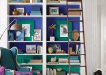
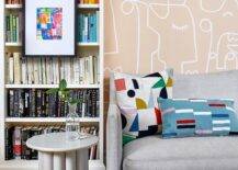
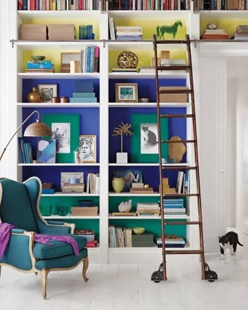
The back of a bookcase is a prime spot to do a little color blocking. Painting out the back in bold colors will add a bright pop to any space.
Accessories
You can also use color blocking in your accessories. For example, choose a rug with contrasting colors or a set of throw pillows with bold patterns and bright colors. This will add interest and texture to your room.
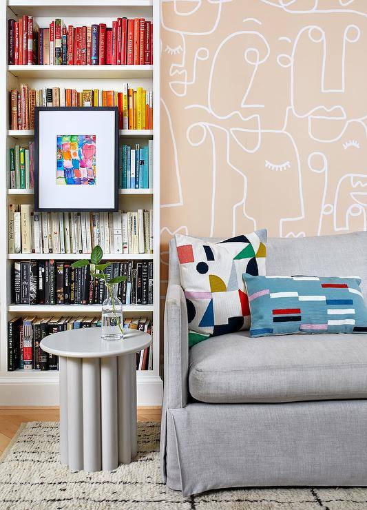
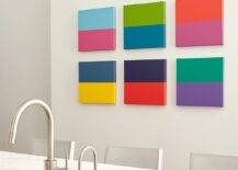
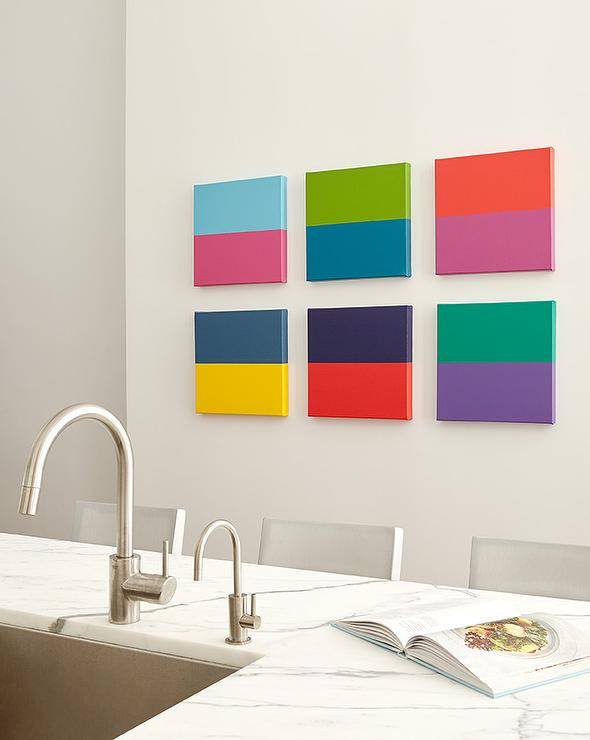
Artwork
Another way to use color blocking is through artwork. Choose a piece of art that features contrasting colors and hang it on a neutral-colored wall. This will create a focal point in the room and add interest.
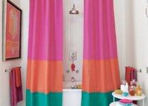
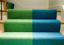
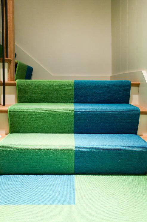
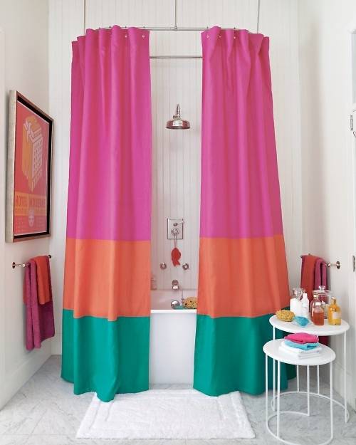
Fabrics
Finally, you can use color blocking in your fabrics. Choose curtains, tablecloths, or even bedding with contrasting colors and patterns. This will add a fun and playful element to your decor.
In conclusion, color blocking is a versatile and fun way to add interest to your home decor. Whether you choose to use it on your walls, furniture, accessories, artwork, or fabrics, this technique will add a pop of color and personality to your home. So go ahead and experiment with color blocking in your home!
Stair railings serve both functional and decorative purposes in a home. They provide safety and support when climbing up and down the stairs while also adding a touch of style to the overall design of the space. With so many options available, it can be overwhelming to choose the perfect stair railing for your home. In this article, we will explore a variety of stair railing ideas that will inspire you to create a unique and stunning staircase.
Metal Railings
One popular trend in stair railing design is the use of metal. From sleek and modern stainless steel to rustic wrought iron, metal railings can add an industrial or elegant touch to your stairs.
For a contemporary look, consider a simple and minimalist metal railing with clean lines and no adornments. On the other hand, if you want to add some flair, opt for a more ornate wrought iron railing with intricate designs and scrollwork.
Wood Railings
Another popular material for stair railings is wood. Wood railings can range from classic and traditional to modern and sleek.
For a rustic or farmhouse look, consider a wooden railing with a distressed finish or natural wood grain. If you want to add a touch of elegance, choose a dark-stained wood with smooth, polished lines. Wood railings can also be paired with metal accents for a unique and trendy look.
Glass Railings
Glass railings are a modern and luxurious option for staircases. They allow for an unobstructed view of the surrounding space and can make a small area appear larger and more open.
Glass railings can be frameless for a clean and seamless look, or framed with metal or wood for added support and style.
Unique Railings
For a more unique and creative approach to stair railing design, consider incorporating unconventional materials such as cable, rope, or even tree branches. Cable or rope railings can add a nautical or beachy vibe to your stairs, while tree branch railings can create a natural and organic feel.
Adding Interest
Don’t forget about color and lighting when designing your stair railing. A pop of color can add personality and interest to a traditional railing, while lighting can create a dramatic and eye-catching effect. Consider integrating LED lights into your railing for a modern and energy-efficient touch.
10 Design Tips for Choosing a Stair Railing
Safety first: The primary function of a stair railing is to provide safety and support. Choose a railing that is sturdy, meets code requirements, and can support the weight of individuals using the stairs.
Material: Consider the material of the railing. Common materials include wood, metal, and glass. Choose a material that complements the style of your home and fits within your budget.
Style: The style of the railing should match the overall design of your home. Whether you prefer a modern, traditional, or eclectic style, choose a railing that enhances the aesthetic appeal of your home.
Color: If you choose a wooden railing, consider staining or painting it to match the surrounding decor. If you opt for a metal railing, choose a finish that complements the surrounding decor.
Height: The height of the railing should meet code requirements and provide adequate support. Standard height for residential stair railings is 36 inches, but this can vary based on local building codes.
Spacing: The spacing between spindles or balusters should meet code requirements and prevent individuals from falling through the railing. The spacing should not exceed 4 inches for safety reasons.
Lighting: Consider adding lighting to the railing to enhance visibility and safety. This can be achieved through the use of LED strips, recessed lighting, or wall-mounted fixtures.
Durability: Choose a railing that is durable and can withstand wear and tear. This is especially important for outdoor railings that are exposed to the elements.
Maintenance: Consider the maintenance requirements of the railing. Depending on the material, some railings may require more maintenance than others. Choose a railing that fits within your maintenance budget and schedule.
Budget: Finally, consider your budget. While a stair railing is an important investment, it should not break the bank. Choose a railing that meets your safety, style, and budget requirements.
In conclusion, stair railing design is an important element in creating a functional and stylish staircase. From metal and wood to glass and unconventional materials, there are endless options for creating a unique and beautiful railing. By considering your personal style and the overall design of your home, you can choose the perfect stair railing to elevate your space.
Frequently Asked Questions (FAQs)
What materials are commonly used for stair railing designs?
The most common materials used for stair railing designs include wood, metal, glass, and cable railing.
How do I choose the right stair railing design for my home?
Consider the style of your home and the overall aesthetic you want to achieve. Look for inspiration online and consult with a professional to help you make the best decision.
Are there any building codes or regulations I need to follow when installing stair railings?
Yes, building codes and regulations vary by location and may dictate the height, spacing, and other specifications of your stair railing.
Can I install a stair railing myself or do I need to hire a professional?
It is possible to install a stair railing yourself, but it is recommended to hire a professional to ensure proper installation and compliance with building codes.
Are there any design trends in stair railings?
Yes, some popular design trends in stair railings include minimalist designs, mixed materials, and unique shapes.
How do I maintain my stair railing?
Regularly clean your stair railing with a mild cleaning solution and avoid using harsh chemicals or abrasive materials that could damage the material.
Is it possible to customize a stair railing design?
Yes, many stair railing manufacturers offer customized designs to fit your specific needs and preferences.
How much does a stair railing installation cost?
The cost of a stair railing installation depends on various factors such as the material, design, and complexity of the installation. It is recommended to get quotes from multiple professionals to find the best price.
Choosing the right paint color for your bedroom is no easy task, and if you’re like most people who dread the idea of painting, you will want to ensure that you select a shade that will withstand the test of time. Choosing the right paint color that will never go out of style is no easy task, so we have compiled a list of the 13 best bedroom colors for you to choose from.
Picking the perfect paint color can make or break the entire look of a bedroom. Color can affect your mood, making you feel energized or calm. It can also make a space look smaller and cozier or open a room up. But there are many things to ponder in deciding on the right shade: Will the year’s trending colors stand the test of time? How do you incorporate new hues into the room’s existing furniture, accents, and décor scheme? And how much should you consider the room’s lighting (or lack thereof)?
Warm Griege
Gray has been a longtime go-to, but its beige-inspired cousin is just as easy to love. The perfect greige is a warm, not at all-cold gray that works anywhere.
Dusty or Light Blue
Blues have long been a favorite shade throughout the home, from living rooms to kitchens — but especially favored for the bedroom. A light or dusty blue is a calming shade that will allow you a tranquil bedroom retreat that will stand the test of time.
Warm White
Whites are a classic favorite neutral. There is a warm white paint color appropriate for every room. Every designer swears by white, and most gravitate to warm white. The creamy undertones keep it from appearing too cold and flat. It adds the right amount of warmth while still feeling crisp and clean.
Complex Cream
When it comes to paint colors, nothing is as ageless as a complex cream. Essentially, we’re talking about creamy beiges with a yellow, green, orange, or pink undertone. They are called ‘complex’ because there are more pigments in them than in a regular cream color.
Taupe
Choosing a neutral, such as Taupe, is a smart choice because it is so versatile and has proven to withstand popularity in homes over time.
Gray
Sick of white walls? Select a soft shade of gray—trendy and timeless, especially in the bedroom.
Navy
While it may seem like a bold and daring choice and one that may date itself, it’s actually the contrary. Navy has a bold elegance and sophistication that will withstand current trends and move nicely into future ones.
Antique White
For an all-white look with just a little oomph, try an antique white paint color for the walls, then paint the trim and other millwork a brighter white to accentuate the pretty detailing. Complete the pretty tone-on-tone with farmhouse classics such as a white iron bed and matelassé bedding.
Warm Brown
Try a medium brown paint color if you’re looking for a neutral that lends a masculine vibe. The rich neutral delivers warmth without overpowering the room and looks great when paired with white trim, natural wood finishes, and navy or dark green bedding.
Beige
Beige is a perfect neutral! With just a hint of a light brown-cream and the perfect balance of white, this color will never fade in popularity and makes accessorizing and decorating increasingly easy.
Light French Gray
The versatility of this neutral gray leans a bit cooler with slight undertones of blue and brown. This calm and serene wall color works much better for bedrooms. It can open up a smaller room’s look and feel while offering enough contrast against stark white trim and white bedroom ceilings.
Light French Gray matches beautifully with a bedroom’s natural or honey oak wood floors. Accordingly, its cool properties help tone down the yellow undertones of lighter wooden floors.
Earthy Green
Bringing earthy greens into the bedroom can also help transform it into a much more grounding space. A mossy or olive green is a warm and trendy color that will transition nicely through time.
Minty-Bluish-Green
A neutral and inviting wall color that’s a designer favorite for bedrooms is a shade of minty-blueish-green. A serene and delicate bedroom color that’s both elegant and timeless.
Inspired by the sea, colors in this range are calming and tranquil and create a relaxing space that you can enjoy for years to come.
Tips for Choosing the Right Colors
Colors that may help you sleep
While you may paint your walls for aesthetic charm, the colors may affect you psychologically, including your capability to sleep. Specific colors may stimulate relaxation, while others stimulate your senses and make you more awake.
Overall, muted colors are the best for your bedroom walls, and blue, green, and yellow may offer the most benefits.
Blue
Blue is perhaps the best color for your bedroom. Not only is it more muted, but blue tones also tend to have more calming effects on the brain. All shades of blue can evoke a tranquil atmosphere but stick with lighter shades on your bedroom walls for the best effect.
Green
Green can be reminiscent of nature, which may put you in a relaxing mood. For many, green is also a harmonizing and refreshing color of choice.
Yellow
While yellow isn’t always sleep-inducing, it can be helpful to wake up in a yellow bedroom because of its happy connotations. As with blue and green, stick with lighter shades that are less likely to distract you from sleep.
Earth Tones
Certain earth tones may also be appropriate for your bedroom walls, as long as they’re not too dark. Other options include beige and soft white. Silver is another alternative that may create a more peaceful atmosphere conducive to better sleep.
Avoid glossy paint
No matter which color you choose, the paint’s finish may be equally important in terms of sleep quality. An overly glossy finish can reflect light and, in turn, stimulate your brain, so aim for a more flat or matte one instead.
As a rule, overly vibrant colors should be avoided in bedrooms. These include loud reds and oranges, which are considered to be energetic and uplifting colors. Red can increase your fight-or-flight instinct, making you more alert and aware of your surroundings.
Bright or neon pinks and purples may also be too stimulating when you’re winding down for sleep. Dark grays and browns aren’t recommended because they may evoke feelings of uncertainty.
Consider a more muted version if you simply must have a more vibrant color. For example, a bright purple may be swapped out for lavender, and fire-engine red can be replaced with a soft salmon shade.
Depending on the layout of your home, you may still be able to incorporate some of the more vibrant colors in other rooms of your home. Consider saving the more energetic colors for your home office or your child’s playroom.
Interior Bedroom Color Advice
We recommend an eggshell finish for any bedroom paint hue instead of a flat or matte sheen. Whether you have a small bedroom or a larger space, headboards, nightstands, or dressers often scuff the walls. Hence, an eggshell finish on your bedroom’s walls is more resilient and more convenient to clean than flatter paint finishes.
Frequently Asked Questions (FAQs)
Which is the most beautiful colour for bedroom?
It is commonly said that white is the best color for a bedroom as it signifies zero negativity. White makes everything clean and flawless, and symbolizes purity and peace within the family. Also, you can use colors like light shades of pink and orange for warmth and love among the couples.
What colors are calming for sleep?
The best colors for sleep are blue, yellow, green, silver, orange, pink, and white. These colors reduce stress and soothe the nervous system. Try to stick with neutral or pastel shades for a soft, welcoming atmosphere.
What is the most restful color for a bedroom?
Blue promotes a feeling of calmness and serenity. It can also be linked to feelings of trust, stability, and dependability. Households that have blue bedrooms are said to have the best night’s sleep compared to any other color.
What color makes a bedroom happy?
Happy colors are bright, warm colors like yellow, orange, pink, and red. Pastel colors like peach, light pink, or lilac can also have an uplifting effect on your mood. The brighter and lighter the color, the more happy and optimistic it will make you feel.
0 comments: