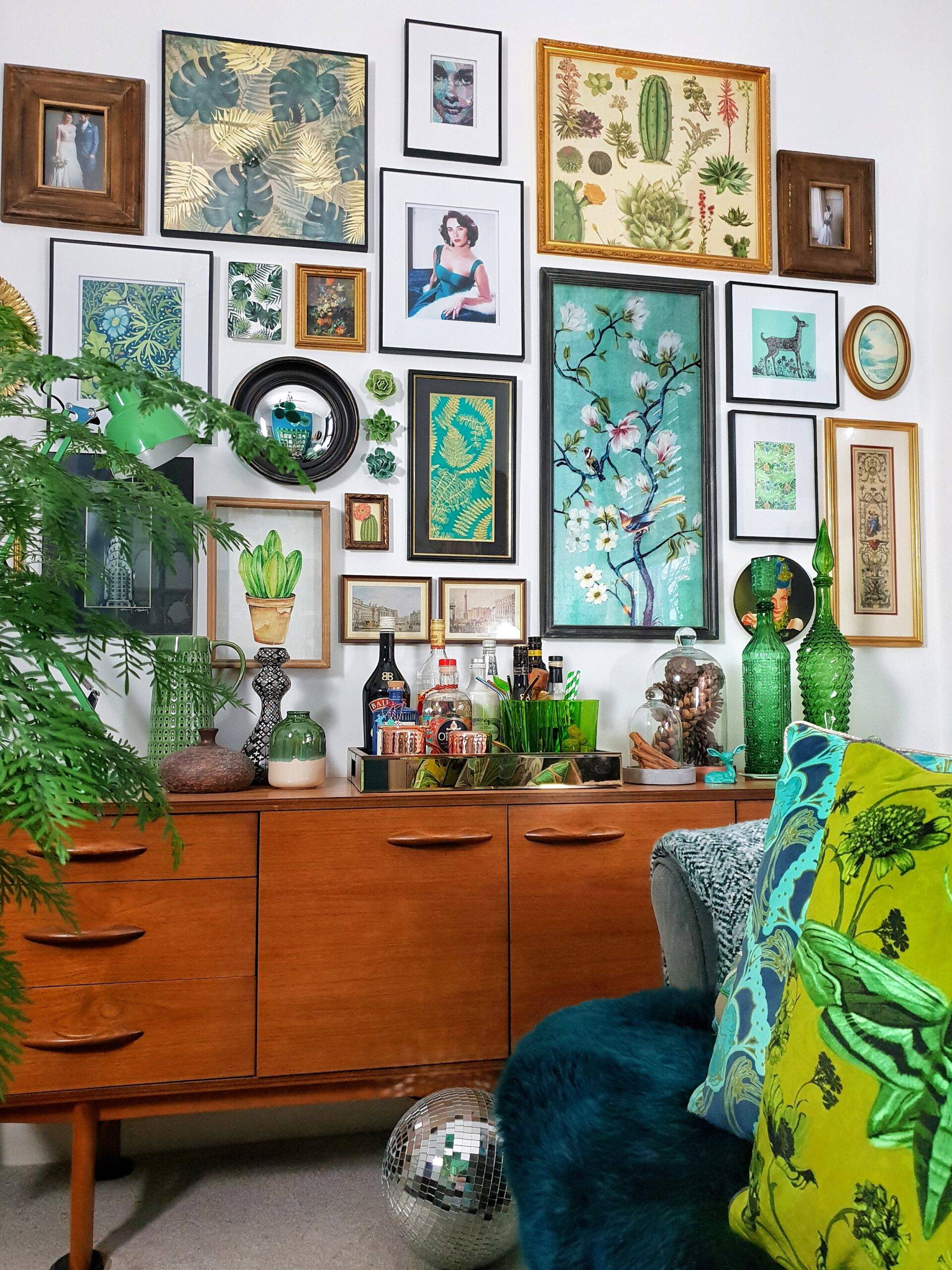
A striking gallery wall is the perfect way to infuse character into a space, regardless of your style. Curating a tasteful gallery that complements a room can be challenging, as there are no strict rules for frame selection and layout. If you’ve struggled to create an aesthetic arrangement, learn from the most common mistakes made by decor enthusiasts.


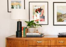
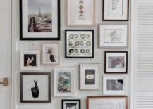
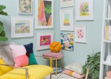

Not matching your style
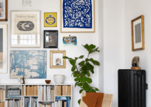
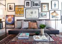
The first secret for a tasteful gallery wall that complements the space is to match it to your interior style. For example, ornate frames might not be the ideal fit for a minimalist living room. Unless you have an excellent eye for design and prefer a maximalist vibe, it would be best to match the frame style to the room.
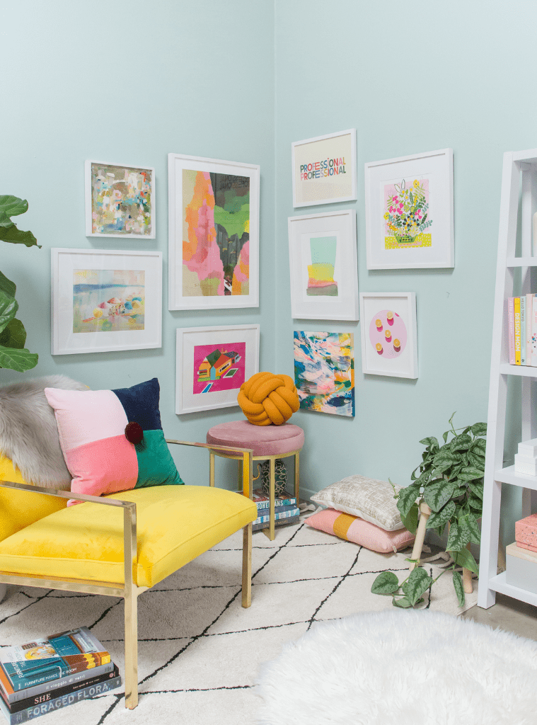
If you prefer a mismatched look, feel free to choose different frames that can vary in size and thickness. However, keep the style consistent for a refined and balanced look.
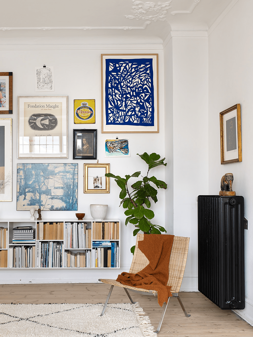
Not planning the layout
Choosing the right frames and art aren’t the only challenges when curating a gallery wall. Correctly positioning your pieces makes a huge difference in the outcome, so plan your layout before you hammer those nails.
Measure the width and height of your wall to determine the gallery wall size. Next, gather all your frames and create an arrangement on the floor. This step makes it easy to arrange the gallery wall and fix the odd parts. Alternatively, you can mark the frames with tape directly on the wall. Following these steps makes it easier to curate a visually pleasing gallery wall that flatters the room.
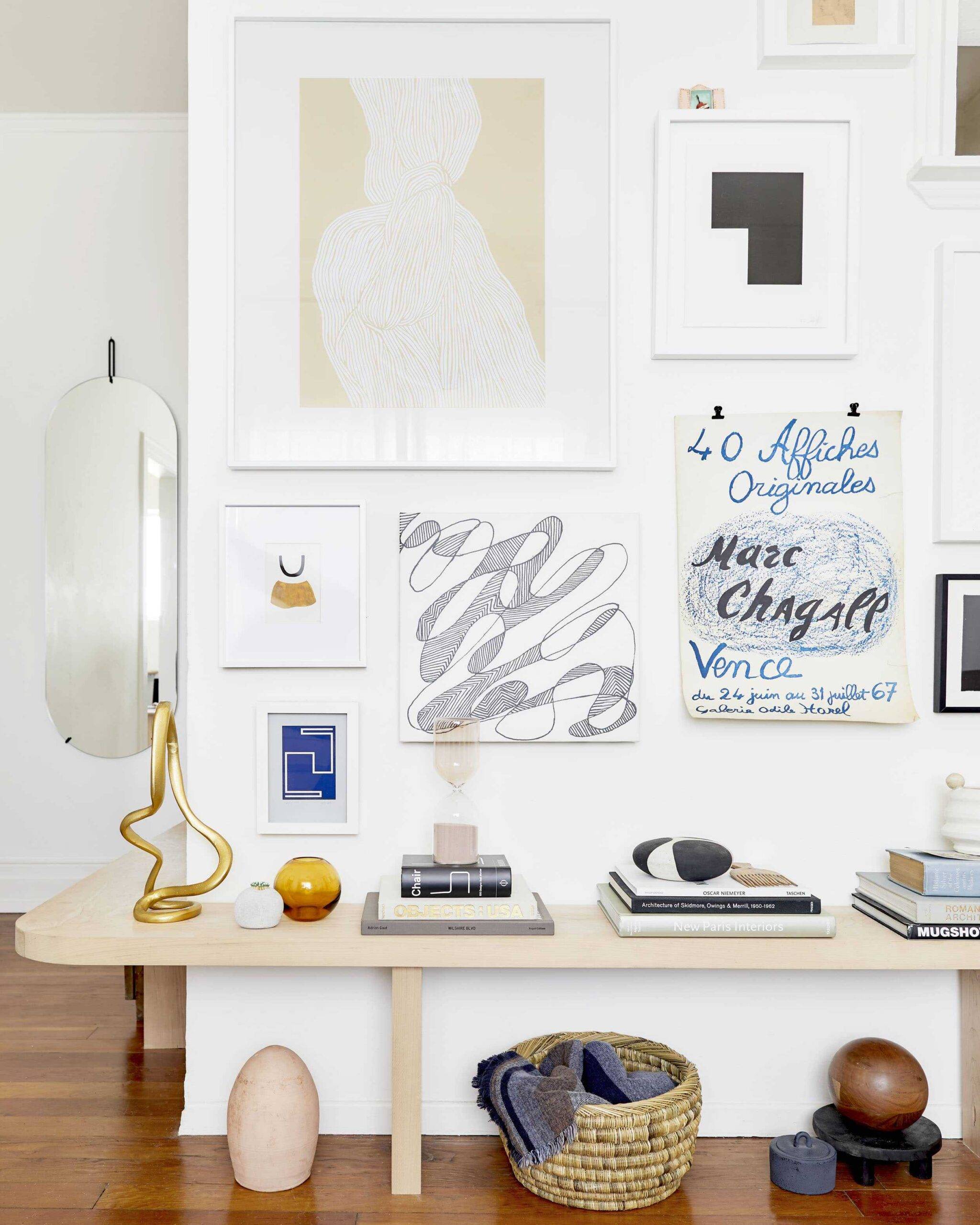
Not adding meaningful pieces
Curating a gallery wall doesn’t have to mean you should get generic prints from the store. Instead, feel free to add pieces with meaning or a background story.
Making some DIY art is an excellent starting point. Or, enhance your collection with personal photos to bring some nostalgic charm. Displaying travel souvenirs in a shadow box frame is another creative idea.
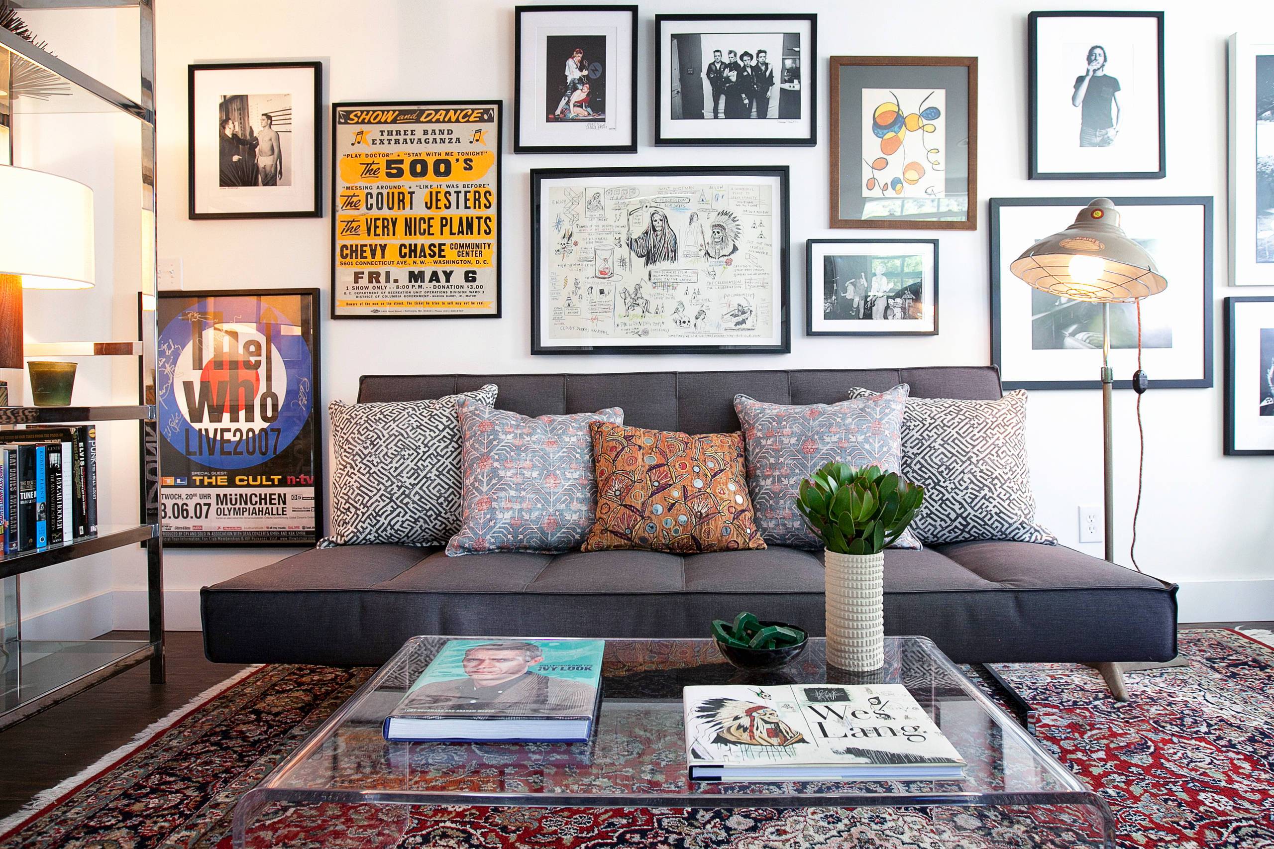
Too much blank space
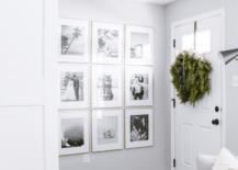
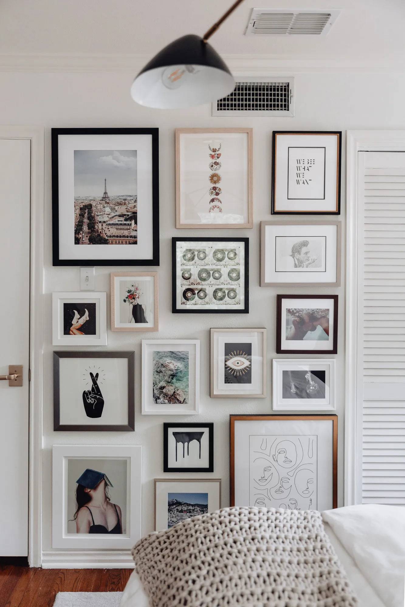
Leaving gaps between the frames leaves negative space, allowing the beauty of each piece to stand out. However, it is essential to achieve the proper balance since too much distance between your artwork can look awkward. Maintaining a three-inch gap between the frames leaves enough breathing room to appreciate the individual pieces.
For a cohesive overall presentation, keep a consistent distance throughout the arrangement.
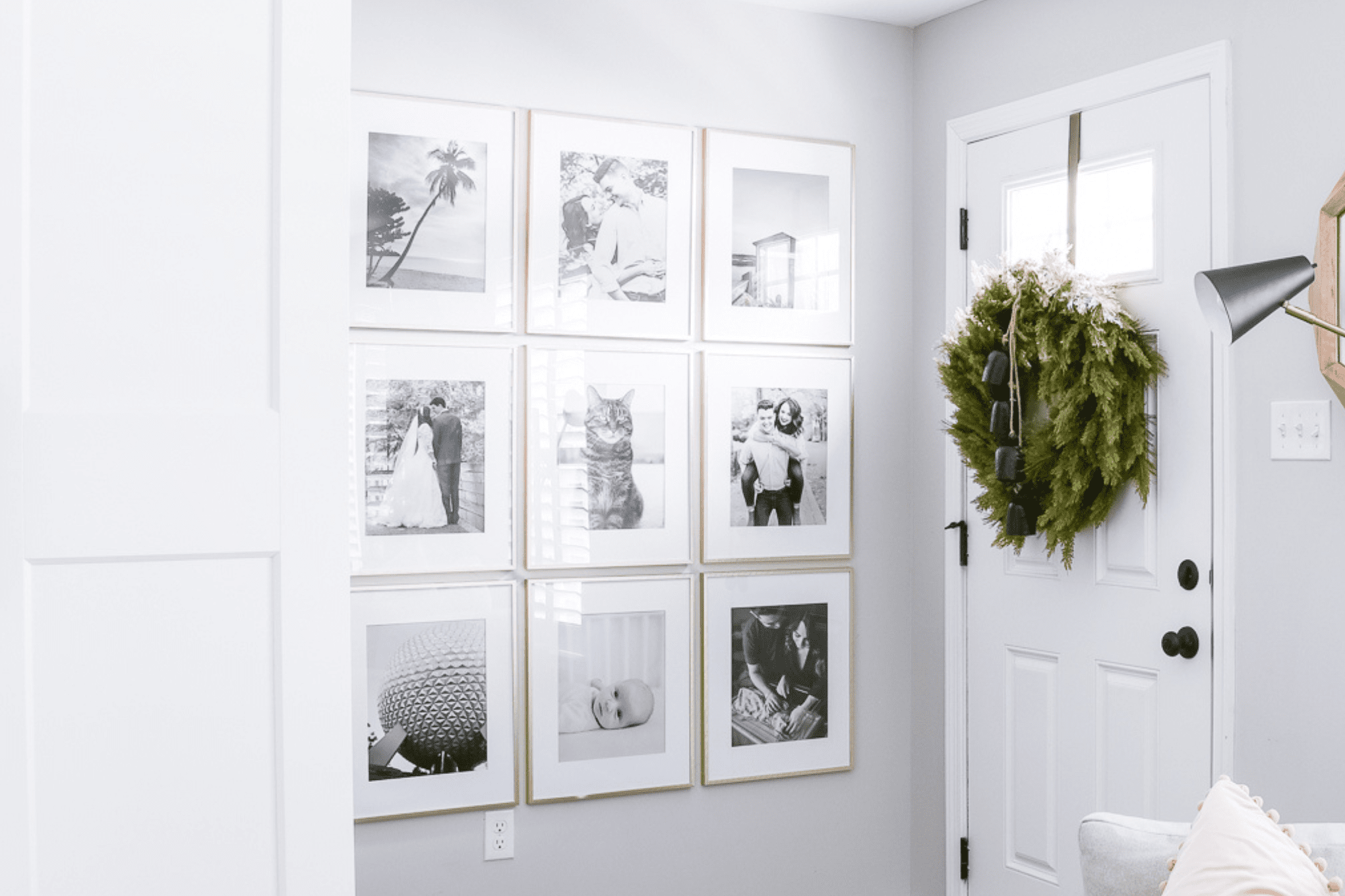
Not minding the design rules
While you have complete freedom to curate a gallery wall that suits your space, some design principles shouldn’t be overlooked. Don’t forget that the best positioning for the arrangement is at eye level.
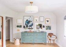
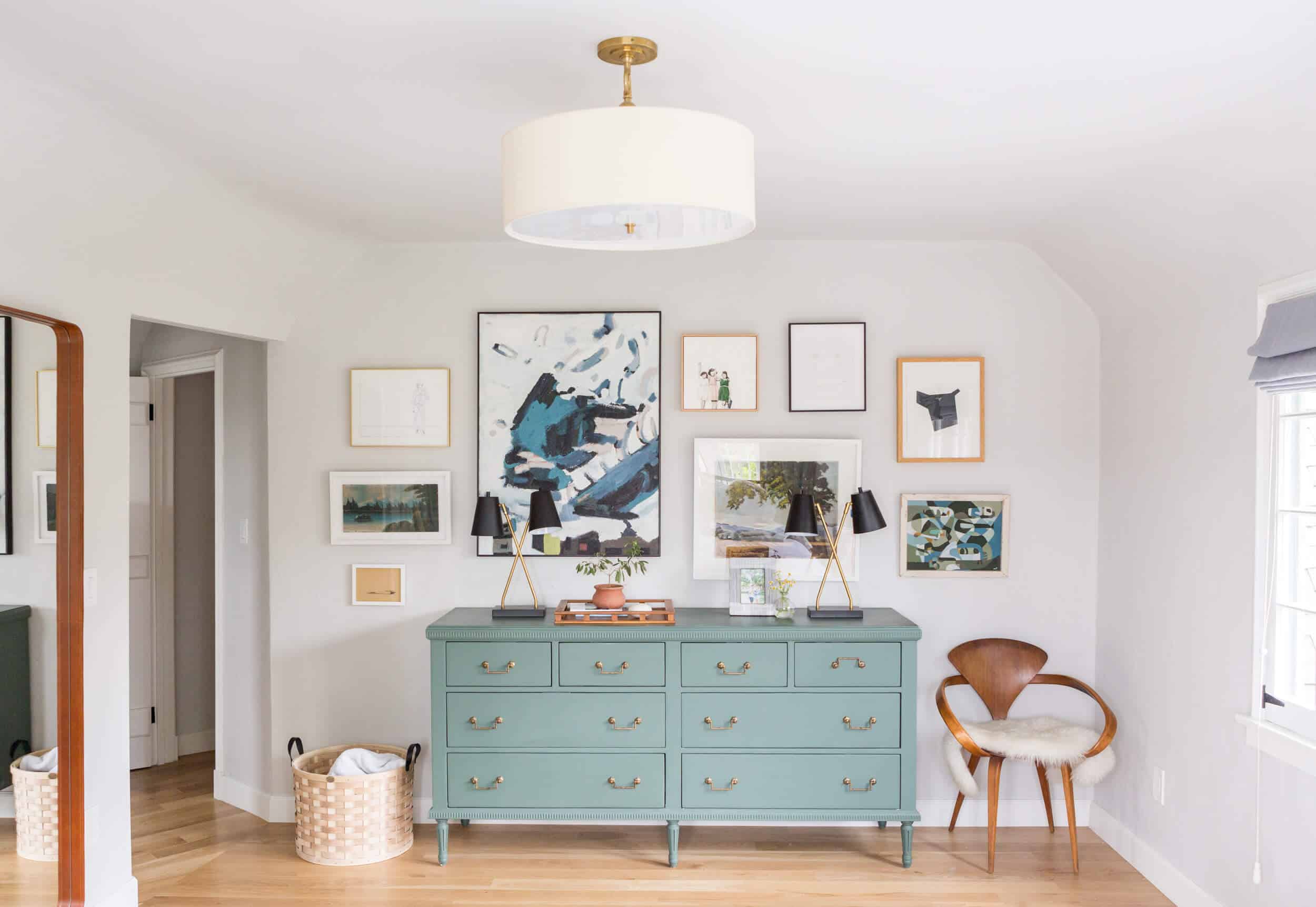
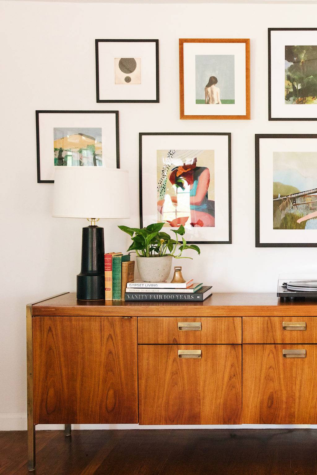
If the gallery wall is above a piece of furniture, such as a couch or dresser, leave at least 12 inches of space between. Make sure the gallery is centered above the furniture for a harmonious look.
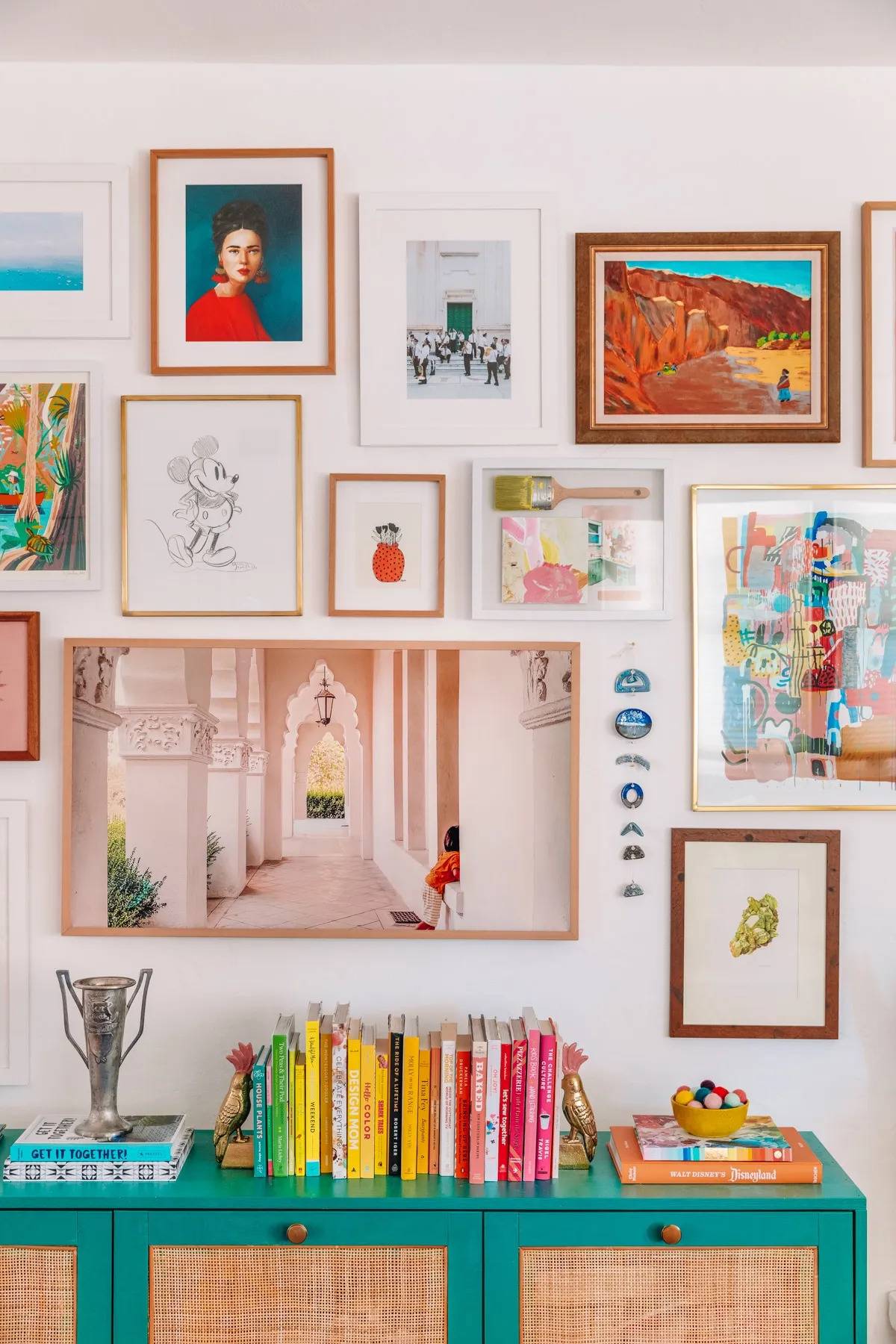
You're reading 5 Common Mistakes People Make When Creating a Gallery Wall, originally posted on Decoist. If you enjoyed this post, be sure to follow Decoist on Twitter, Facebook and Pinterest.
from decoist https://ift.tt/umWlM3v

0 comments: