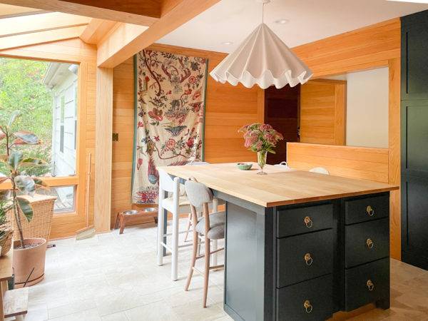
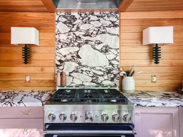
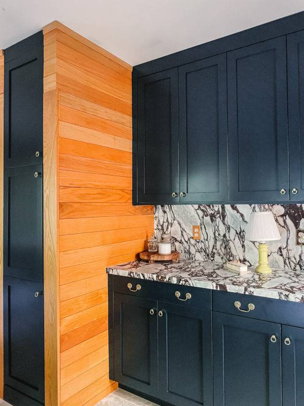
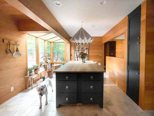
When Kate Arends, founder and creative director of lifestyle brand Wit & Delight, started her journey to remodel her outdated kitchen to encompass a modern design with ornate details, she knew it would be a laborious project. With the help of Skipp, the team built a custom kitchen that balances these two contrasting elements.
Arends’ dream was for the final space to be a place for everyday cooking and elevated entertainment. Between running her business and hosting get-togethers, she often finds that the kitchen sparks the most creativity and collaboration.

One of the main goals for the space was to make the kitchen more functional with an emphasis on making it the heart of the home, as the outdated layout of the kitchen did not work for Arends’ family or their lifestyle. With the help of Skipp’s technology, the extensive remodeling process is broken into four easy steps: 3D measurements, personalized layouts, tailored designs, and streamlined construction.
With its proprietary 3D scanning technology, Skipp provided Arends with accurate measurements and outlined the potential locations for sinks, fridge, outlets, windows, etc. While there are other companies that are creating generative layouts and designs for new lots, they are generally dealing with a blank canvas. However, there is a layer of complexity when the space is already built and has constraints. Skipp provided Arends with curated layouts, materials and pricing in three days, all aligned with her needs.

Together, Skipp and Arends considered durability in every element they added to this space. This kitchen was designed, first and foremost, for utility. While many of the finishes and products are high-end, nothing is too delicate, and many of the materials like the marble flooring, marble countertops, and lacquered brass shelves are intended to weather beautifully over time.
For the final design, Arends took inspiration from recent stays in Jackson Hole and Paris. The resulting design has the warmth you’d find at a premier hospitality space, but with the intimacy of a home kitchen. Blending with the traditional design of the rest of the home, modern elements like wood paneling are balanced out by ornate details such as the marble flooring. Arends selected custom paintable cabinet fronts and Sulking Room Pink and Hague Blue from Farrow & Ball for the final palette.

In addition, Kate found inspiration for this remodel from her passion to cook for guests, family, or friends that pop in on a whim, emphasizing the need to have the kitchen space feel like one big inspired gathering area. She knew KitchenAid would be perfect for the appliances, as it is not only a brand for those who love to cook, but a brand for designers and homeowners who are creating spaces built to fuel their passion in the kitchen.
Despite the fact that Arends owns her lifestyle brand, she ran into a common challenge people face when remodeling their home: she was worried it would be “too much” or she’d get tired of the bold colors.

At the end of the day, she trusted her gut and kept returning to the bold, colorful samples and patterns versus the classic neutrals.The final kitchen is an eccentric and modern space that is just as welcoming as the rest of the traditional home. After reflecting on the finished space, Arends says this is the favorite room she has designed and it had the most successful renovation process.
You're reading Kate Arends’ Eccentric and Modern Kitchen Renovation, originally posted on Decoist. If you enjoyed this post, be sure to follow Decoist on Twitter, Facebook and Pinterest.
from decoist https://ift.tt/0CHNbyd

0 comments: